On this page
- Why email is still the best channel for capturing leads
- 1. Offer a lead magnet people actually want
- 2. Match the offer to the page it appears on
- 3. Ask for as little as possible
- 4. Pick the right display mode: inline, popup, slide-in or exit intent
- 5. Write copy that sells the outcome, not the newsletter
- 6. Use double opt-in where list quality matters
- 7. Record consent as if you will need to prove it
- 8. Keep bots out without punishing real people
- 9. Follow up within minutes, not weeks
- Setting it up in Send Tim
- How to measure whether it is working
Most people who visit your website leave and never come back. They read a post, glance at the pricing page, and close the tab. Email lead generation is the discipline of giving the right visitors a good reason to leave an address behind, so the conversation can continue on a channel you own.
This guide covers the nine tactics that make the biggest difference to a signup form: what to offer, where to show it, how much to ask, and how to collect consent that will still hold up a year from now. None of it depends on a particular tool, but where it helps we show how the same setup looks in Send Tim.
Why email is still the best channel for capturing leads
Social reach rises and falls with every algorithm change, and paid traffic stops the moment the budget does. An email list is different: it is an audience you own, you can reach it whenever you have something worth saying, and each subscriber arrives with context about what they were interested in when they signed up.
That context matters more every year. Browsers such as Safari and Firefox block third-party cookies by default, and ad platforms see less of the journey than they used to. An address someone gave you directly, together with the page and the offer they signed up from, is first-party data that no browser update can take away.
1. Offer a lead magnet people actually want
"Subscribe to our newsletter" is not an offer. A lead magnet is: a specific, immediately useful thing someone gets in exchange for their email address. The narrower the problem it solves, the better it tends to convert, because the visitor can tell in a second whether it is for them.
- Checklists and templates: "The 20-point pre-launch email checklist" beats "Our email marketing guide".
- Calculators and tools: a pricing or ROI calculator whose result is emailed to the visitor.
- Mini-courses: five short lessons over five days, which doubles as your first nurture sequence.
- Discounts and early access: for e-commerce, a first-order code is still the most reliable offer.
- Original data: a benchmark or survey result your audience cannot get anywhere else.
2. Match the offer to the page it appears on
A single site-wide form treats a reader of your beginner guide and a visitor comparing plans on your pricing page as the same person. They are not. Content upgrades, offers that extend the exact article someone is reading, consistently outperform generic forms because they continue a thought the visitor already started.
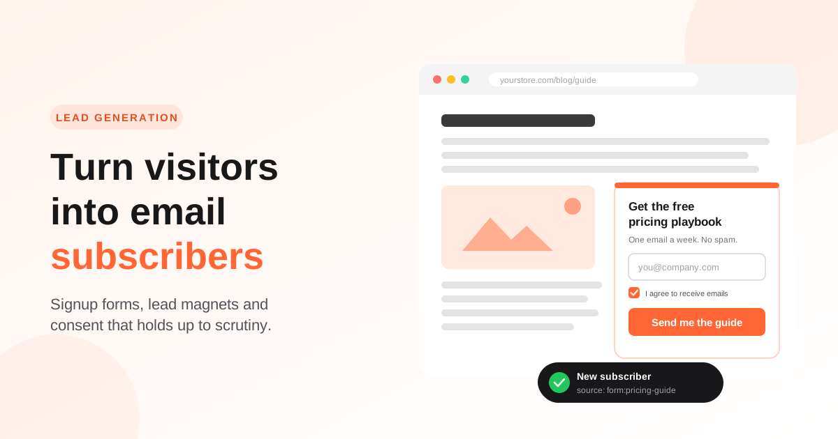
Give each form its own source label (for example form:pricing-guide or form:blog-checklist) and store it on the contact. It costs nothing at signup and later tells you which offers bring in leads who actually buy, not just leads who sign up.
3. Ask for as little as possible
Every field you add is another reason to abandon the form. For a newsletter or a lead magnet, an email address is usually enough; a first name is a reasonable second field if you will genuinely use it to personalize. Company size, role and phone number can wait.
You can still learn those things later, a practice often called progressive profiling: ask one question in the welcome email, use clicks on topic-specific links to infer interests, and offer a preference center where subscribers choose what they want to hear about.
4. Pick the right display mode: inline, popup, slide-in or exit intent
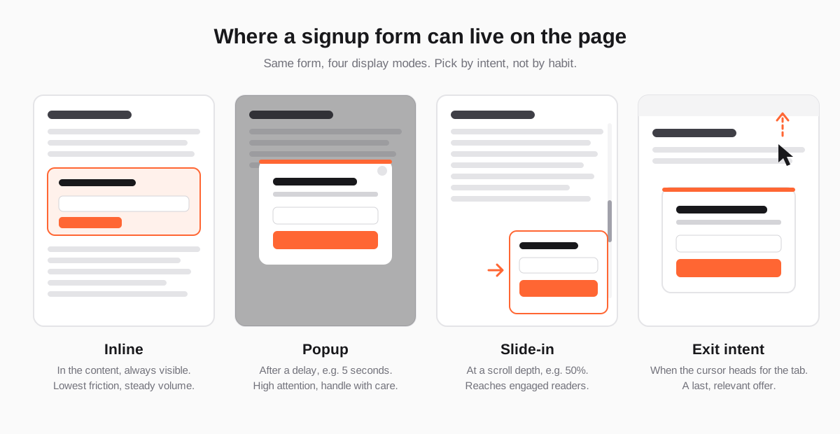
Where a form appears matters as much as what it says. Each display mode trades attention against interruption:
- Inline forms sit inside the content. They interrupt nobody and convert steadily, which makes them the right default for blog posts and resource pages.
- Popups open after a short delay. They get the most attention, which is exactly why they need restraint: show them once per visitor, never on the first second of a mobile visit.
- Slide-ins appear in a corner once a visitor has scrolled a meaningful part of the page, say 50%. They reach readers who have already shown interest without covering what they are reading.
- Exit-intent popups trigger when the cursor heads for the address bar or the close button. Used with a relevant offer, they are a last useful word rather than a nag.
5. Write copy that sells the outcome, not the newsletter
A signup form has about three lines to make its case. Use them for the result the visitor gets, a promise about frequency, and a button that says what happens next.
- Headline: the outcome. "Price your SaaS with confidence" rather than "Join our mailing list".
- Supporting line: what to expect. "One practical email a week. Unsubscribe any time."
- Button: the action in the first person. "Send me the checklist" rather than "Submit".
6. Use double opt-in where list quality matters
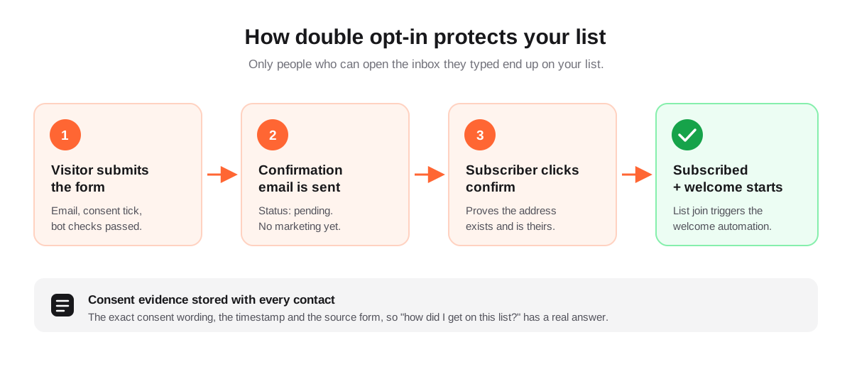
Double opt-in sends a confirmation email and only subscribes the person once they click the link in it. It costs you some signups: people who never open the confirmation are not added. What you get in return is a list with no typos, no fake addresses, no one signed up by someone else, and far fewer spam traps.
That trade usually pays for itself in deliverability. Mailbox providers judge you by how recipients react; a list full of addresses that never engage drags down every campaign you send. In some markets, Germany being the best-known example, double opt-in is also the accepted way to show that consent really came from the address owner.
7. Record consent as if you will need to prove it
Under the GDPR, the organization relying on consent has to be able to demonstrate it (Article 7(1)). "They filled in a form at some point" is not a demonstration. For each contact, keep:
- the exact consent wording they saw, since that wording changes over time;
- the timestamp of the signup and, with double opt-in, of the confirmation;
- the source: which form, on which page, or which import.
Keep the checkbox unticked by default. The Court of Justice of the EU confirmed in the Planet49 case (2019) that a pre-ticked box is not valid consent. If the lead magnet and the newsletter are separate things, say so plainly next to the checkbox.
8. Keep bots out without punishing real people
Public forms attract bots, and bot signups are worse than no signups: they bounce, they can hit spam traps, and they inflate your numbers. CAPTCHAs stop some of them but also cost real conversions. Quieter defenses catch most automated submissions with zero friction:
- a honeypot field that humans never see but naive bots fill in;
- a timing check that rejects forms submitted faster than a person could type;
- an allowed-origins list, so your embed only accepts submissions from your own domains;
- double opt-in, which quietly neutralizes whatever gets through.
9. Follow up within minutes, not weeks
A new subscriber is never more interested than in the minutes after signing up. If the first email they receive is next month's newsletter, they will not remember who you are. Deliver the lead magnet immediately and start a short welcome sequence that sets expectations and earns the first click.
We cover how to build that sequence, including branching on engagement and when to stop emailing people who never respond, in Lead Nurturing Emails: How to Build a Welcome Sequence That Converts.
Setting it up in Send Tim
Everything above maps onto the form builder in Send Tim. You build the form once and choose how it is displayed; the preview uses the same renderer as the live form, so what you see is what visitors get.
- Fields map straight onto contact fields and custom fields, so a "Company" or "Plan interest" answer is immediately usable in segments.
- Display modes: inline, modal, slide-in with a scroll-depth trigger, or popup with a delay, each with an optional exit-intent trigger. Switching modes does not require re-pasting the embed code.
- Consent field with your own wording. The text, timestamp and source are stored on the contact as evidence.
- Double opt-in can follow the list setting or be forced on or off per form.
- Bot protection with a honeypot, a submission timing check and an allowed-origins list, without a CAPTCHA.
- After submit: show a thank-you message or redirect to a page of your own, such as the download.
How to measure whether it is working
Signup volume is the vanity metric of lead generation. The more useful questions are downstream: do people from this form open and click the welcome sequence, do they convert, and do they stay subscribed? Because every contact carries the source it came from, you can build a segment per form and compare them over the first 30 days.
- Form conversion rate: submissions divided by visitors who saw the form. Compare forms and placements against each other, not against someone else's benchmark.
- Confirmation rate for double opt-in. A low rate usually means the confirmation email is landing in spam or its subject line is unclear.
- Welcome sequence click rate by source. This is the earliest reliable signal of lead quality.
- Unsubscribes and complaints in the first two weeks. A spike means the offer attracted the wrong audience or set the wrong expectations.
Pick one form and one page, apply the tactics above, and measure for a month before rolling the pattern out across the site. A few well-matched, well-placed forms nearly always beat a popup on every page.
Frequently asked questions
What is a good conversion rate for an email signup form?
It varies widely with the traffic source, the offer and the display mode, so published averages are a weak guide. Measure your own baseline per form and placement, then improve it: a specific lead magnet, fewer fields and a better-timed display usually move the number more than design tweaks.
Do popups hurt SEO?
Popups that cover the main content on mobile right after a visitor arrives from search can count against a page under Google's intrusive interstitial guidance. Inline forms, slide-ins and popups that appear later or on exit intent are generally fine, as are legally required banners.
Is double opt-in required by the GDPR?
No. The GDPR requires consent to be freely given, specific, informed and unambiguous, and requires you to be able to demonstrate it. Double opt-in is not mandated by the regulation itself, but it is a strong way to prove the address owner consented, and it is standard practice in some countries such as Germany.
How many fields should an email signup form have?
As few as the offer allows: usually just the email address, sometimes a first name. Collect everything else later through the welcome sequence, link clicks and a preference center, when the subscriber already trusts you.