Auf dieser Seite
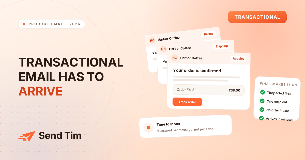
There is a particular kind of waiting that only transactional email produces. Someone has clicked "reset my password", switched to their inbox, and is now refreshing it. Nothing else in your product matters to them until that message arrives. The same applies, less urgently, to a receipt after a payment and a tracking number after a parcel ships.
These messages get less attention than campaigns because nobody is measured on them, and they are usually written once by whoever built the feature. This guide is about the craft of the message itself: what to put in it, how to format it, and what to check before it goes out. If you need the prior question of which messages count as transactional and how to get them delivered at all, the transactional email guide covers classification, sending domains and measurement.

Speed is the first feature, not a nice-to-have
For a password reset or a sign-in code, the useful target is seconds. Past roughly half a minute people request a second one, which is how you end up with two valid tokens, a confused user and a support conversation about which link to use.
The implication is architectural rather than editorial: these messages should not queue behind your campaigns. A send going to forty thousand people can occupy a worker for an hour, and the reset email behind it inherits that wait. Give the time-critical ones their own path.
When you genuinely cannot be fast, say so in the interface rather than in the email. "This can take up to two minutes. Check your spam folder if it has not arrived" sets an expectation and prevents the second request. Saying nothing and hoping is what produces the duplicate.
The subject line is the message, for a lot of people
A meaningful share of transactional email is never opened, because the subject line already answered the question. That is a success, not a failure, and it is worth designing for. Write the subject as the fact, with the identifier people will search for later.
| Instead of | Write | Because |
|---|---|---|
| Thanks for your order! | Order #4182 is confirmed | The number is what they will search for in three weeks. |
| Your password reset request | Reset your password (expires in 30 minutes) | States the action and the deadline that matters. |
| An update on your delivery | Your parcel arrives Thursday, tracking GB0241 | Answers the question without an open. |
| Payment issue | Your card ending 4417 was declined | Names the card so they know which one to fix. |
| Welcome to Harbor Coffee | Confirm your email to finish signing up | The welcome is not the job. The confirmation is. |
Keep the sender name consistent with the product name people recognise, and resist putting the brand first in every subject: "Harbor Coffee: your order is confirmed" wastes the characters a phone will actually show. The same reasoning as subject lines for campaigns applies here, with the difference that curiosity is never the goal.
Include what stops them replying
A good way to audit a transactional email is to read the replies it generates. Every question that arrives more than twice is a detail the message should have contained. In practice it is almost always one of four things: what exactly happened, when the next thing happens, how much was charged, and how to change or undo it.
- What happened, in specifics rather than categories. "Your annual Pro plan renewed" rather than "Your subscription was updated".
- When, as a date a person can act on. "Arriving Thursday 26 November" rather than "within 3-5 business days", which starts an argument about which days count.
- How much, including tax and shipping separately, matching what the card statement will show. Mismatched totals are a chargeback risk.
- How to change it, with a direct link. A cancel link in the renewal notice costs you a few cancellations and saves you the disputes from people who could not find one.
- Who to ask, with a real address rather than a help-centre maze.
Order these by urgency rather than by brand convention. Someone opening a declined-payment email needs the amount and the fix in the first two lines, not after a paragraph about how much you value them.
One action, and it has to survive a blocked image
Transactional emails are read in clients that block images by default and in corporate environments where that is a policy rather than a preference. If the reset button is a picture, a share of recipients see an empty box where their only route forward should be.
Build the button from HTML and CSS, and put the destination in plain text underneath for the clients that mangle it anyway. One action per message: a receipt offering "track your order", "leave a review", "shop similar products" and "refer a friend" has four calls to action and therefore none. Email design covers the dark mode and blocked-image rules, which apply here with less room for error: a broken campaign is an annoyance, a broken reset is a lockout.
The case against no-reply
People reply to transactional email. They reply to receipts to ask about a return, to shipping notices to change an address, and to payment failures because something is wrong and this is the most recent message they have from you. A no-reply@ address turns all of that into either a bounce or silence.
It also discards a signal. Replies are among the clearest positive evidence a mailbox provider can observe, because a person who writes back is unambiguously engaged. An address that cannot receive mail throws that away, and one that does not exist weakens the alignment with your authenticated sending domain.
Route replies to a monitored shared inbox. If volume is genuinely unmanageable, use an address that auto-responds with where to go instead, which is still better than a bounce. The rule of thumb: never send from an address you would be embarrassed to see someone write to.
Format for the person, not for the database
The detail that quietly generates support tickets is time. A delivery window in UTC, or a timestamp in ISO format, is accurate and useless to someone deciding whether they will be home.
- Dates with the weekday: "Thursday 26 November" tells a person more than "26/11/2026", and avoids the American and European date order ambiguity entirely.
- Times with the zone, in the recipient's zone where you know it. "10:30 (Europe/Bucharest)" removes a calculation.
- Money with the currency symbol and code when you sell across borders. "$38.00 USD" is unambiguous; "$38.00" is not.
- Identifiers in a copyable format, not inside an image and not broken across lines.
- Addresses as the customer typed them, so they can spot their own mistake.
If you do not know someone's timezone, say which one you are using rather than guessing. An explicit zone is honest; a silent one is a coin flip.
Send it exactly once
Duplicate transactional email is worse than late transactional email, because the second copy makes the reader doubt the first. Two order confirmations raise the question of whether they were charged twice, which is a support contact and sometimes a chargeback.
They usually come from retry logic that treats an ambiguous failure as a definite one: a request that times out may well have been processed, so a blind retry sends a second copy. Key the send on something stable from your own system, the order id rather than a timestamp, and record that it went out in the same operation that sends it. Email API or SMTP covers why the transport changes how much you learn about that failure.
The checks before you ship one
Run these once per template rather than per send. Once a template is proven, changing the words inside it is safe.
- Read it with images off. Is the action still obvious and clickable?
- Open it in dark mode, in both Apple Mail and Outlook, which invert differently.
- Check it on a phone. Is the button reachable with a thumb without zooming, and is the key fact above the fold?
- Send it to a contact with sparse data. The template that renders beautifully for your complete test record is the one that greets real people with "Hi ,".
- Click every link, including the footer. A broken unsubscribe or help link turns a routine message into a complaint.
- Reply to it. Confirm the answer reaches a human rather than bouncing.
The fourth item catches more real problems than the rest combined. Most transactional templates are tested with a record that has every field filled in, and most real customers have a blank last name, no company, and a phone number in a format nobody anticipated.
For the engineering side of triggering these messages, sending from Supabase Edge Functions and sending from Next.js both walk through the calls and the retry behaviour that keeps a duplicate from going out.
Häufige Fragen
How fast should a transactional email arrive?
For password resets and sign-in codes, seconds. People sit on the inbox after requesting one, and beyond about thirty seconds they request a second, which leaves two valid tokens and a confused user. Receipts and shipping notices tolerate a minute or two, but should not share a queue with bulk campaign sends.
Should transactional emails have an unsubscribe link?
A genuinely transactional message does not need one, because a person cannot opt out of the receipt for something they bought. Add a preferences link anyway if it costs you nothing, and note that the moment you include promotional content prominent enough to be a main purpose of the message, the unsubscribe requirement applies to the whole email.
Is it bad to send from a no-reply address?
Yes, for two reasons. People do reply to these messages with questions about returns, addresses and payments, and a bounce turns a reachable customer into a frustrated one. Replies are also a positive engagement signal for mailbox providers, so an address that cannot receive mail throws that away.
How long should a transactional email be?
As long as it takes to answer what happened, when, how much and how to change it, which is usually under 150 words. Length is rarely the problem; ordering is. Put the fact the person needs in the first two lines and the supporting detail underneath, rather than opening with gratitude.
Can I use the same template for every transactional email?
Share the layout, header and footer, but not the content structure. A receipt needs a line-item table, a password reset needs a single prominent action and an expiry, and a shipping notice needs a date and a tracking identifier. Forcing all three into one template is how a reset email ends up with an order summary nobody asked for.