On this page
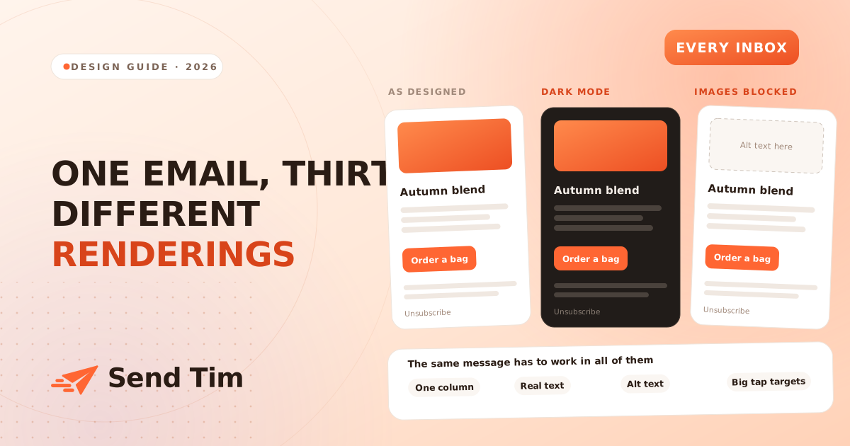
Most email design advice is about taste. This is not that. An email you send today will be re-rendered by Gmail on Android, Apple Mail in dark mode, Outlook on a Windows laptop with images disabled by policy, and a watch face showing the first forty characters. None of them asked your opinion, and several of them will quietly rewrite your colours on the way.
The design job is therefore not making one beautiful render. It is making a message that stays legible through every transformation applied to it. This guide covers the four that break emails most often, and the rules that neutralise each one.
Start with one column, 600 pixels wide
Six hundred pixels has been the safe width for twenty years and still is, because it fits the reading pane in desktop Outlook without horizontal scrolling. More importantly, a single column is the only structure that survives being squeezed onto a phone without any work.
Multi-column layouts can be made responsive, but every extra column is another thing that collapses unpredictably in a client that ignores media queries, and Outlook on Windows ignores most of them. Two columns of equal weight will stack in an order you did not choose. If you want side-by-side content, design it so that reading it top to bottom still makes sense, because on more than half of opens that is what happens.
- One column, 600px, centred on a background colour rather than white, so the edges of the message are visible.
- Generous padding, at least 24px inside the content area. Tight margins look deliberate on desktop and cramped on a phone.
- Stack, do not shrink. Two product cards side by side at 280px each become unreadable at 320px screen width; stacked, they are fine.
- No fixed heights. Text reflows at different sizes in different clients, and a fixed height clips it.
What dark mode actually does to your email
Dark mode is not one feature. Apple Mail and Outlook apply their own colour inversion to messages that do not opt out, Gmail on Android does something slightly different, and the exact behaviour changes between versions. You cannot reliably control it, so the goal is to make the inversion harmless rather than to prevent it.
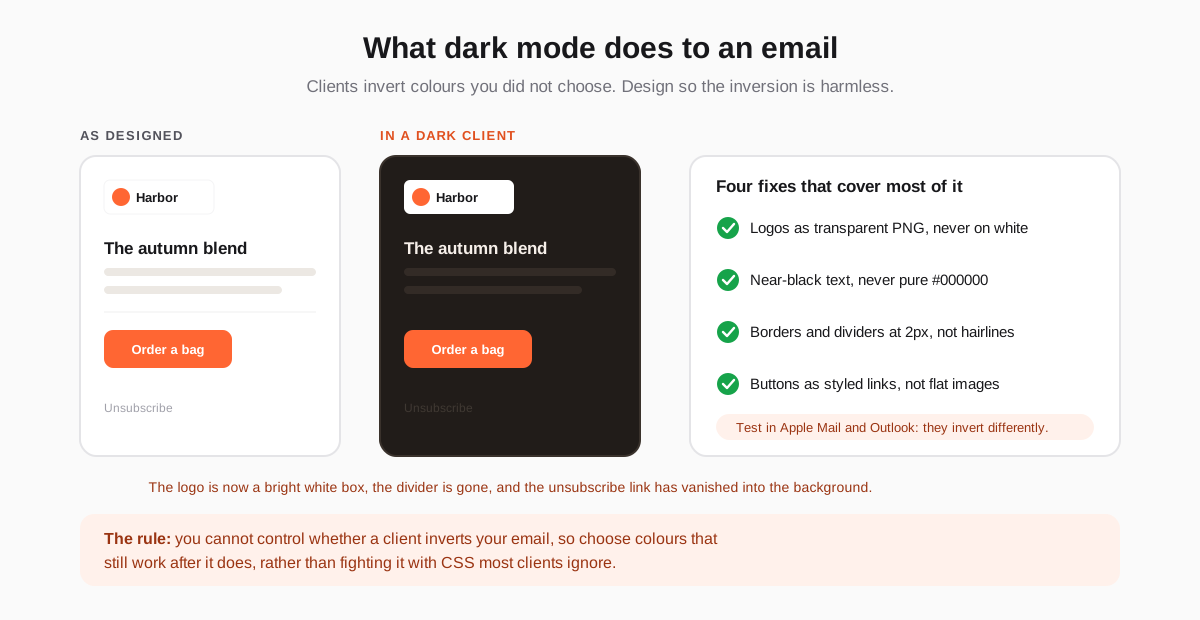
The four failures above cover most of what goes wrong. A logo exported as a JPEG on a white background becomes a glowing white rectangle in the middle of a dark email, because the image itself cannot be inverted. A transparent PNG with a light-coloured mark avoids it entirely.
Pure black text is the second trap. Clients often lighten dark text when inverting, and pure black lightens to a muddy grey that sits badly on a near-black background. Using a near-black such as #1F1B18 gives the client something sensible to work with. Hairline borders disappear because a 1px line at low contrast survives neither inversion nor a high-density screen, so use 2px and a colour with real contrast.
Design for images being off
A meaningful share of your recipients see the first render of your email without images. Outlook blocks them by default for unknown senders, many corporate mail policies block them outright, and some people turn them off to save data. That first render is the one deciding whether the email is worth a second look.
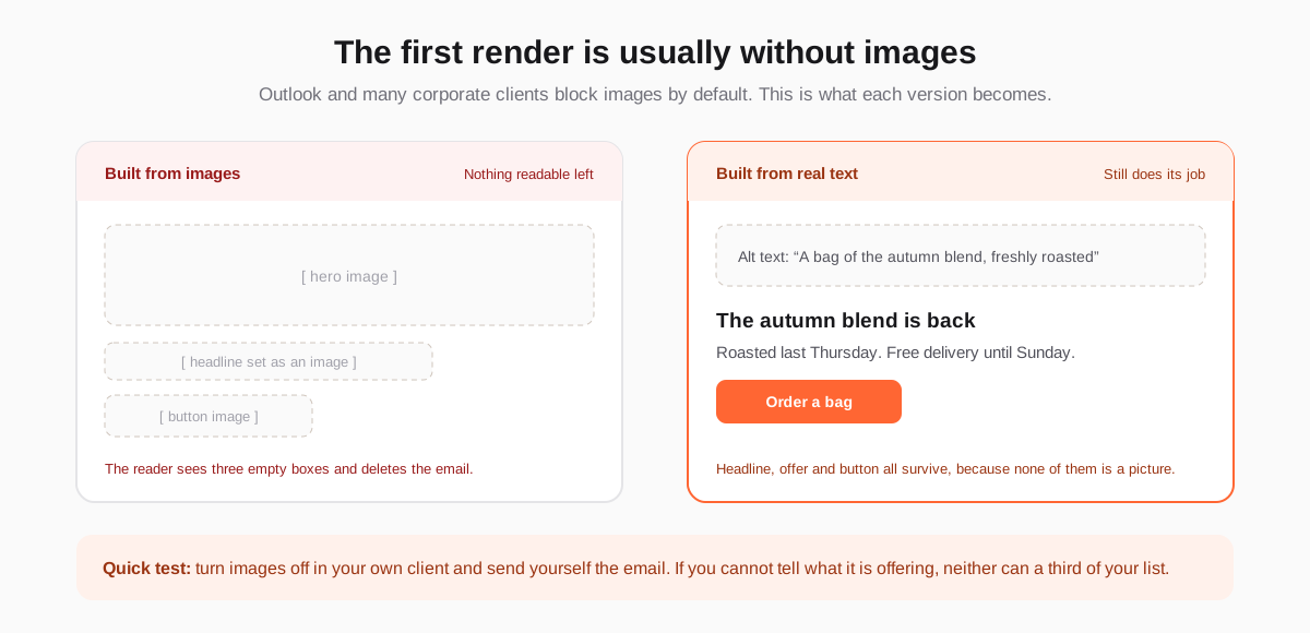
The rule follows directly: anything the reader must see in order to act has to be live text. The headline, the offer, the price, the deadline and the button label are all content, not decoration. Images should add to a message that already works without them.
- Write real alt text, describing what the image shows rather than repeating the filename. With images off, alt text is the only thing in that space.
- Never put the offer in a picture. "30% off this weekend" rendered as an image is invisible to the people most likely to be at work when they read it.
- Make buttons from HTML and CSS, with a background colour and padding, so a blocked image cannot remove your call to action.
- Give alt text a colour and size, so it looks intentional rather than like a broken page.
Type, contrast and tap targets
Accessibility in email is usually framed as a legal or ethical requirement, which is true and also undersells it. Every accessibility rule here is a conversion rule: the person squinting at a 12px grey paragraph on a phone in sunlight is not a minority case, they are your median reader.
| Element | Minimum | Why |
|---|---|---|
| Body text | 16px | Below this, mobile clients may zoom the whole email and break the layout. |
| Line height | 1.5 | Dense paragraphs are the first thing people skip on a small screen. |
| Text contrast | 4.5:1 against its background | Grey on white at 3:1 looks refined on a monitor and vanishes outdoors. |
| Tap targets | 44 by 44 pixels | Smaller than a fingertip means mis-taps, which read as no clicks at all. |
| Space between links | 16px | Stacked links closer than this get tapped by accident. |
| Line length | 60 to 75 characters | Longer lines lose the reader between one line and the next. |
Use real HTML headings rather than bold paragraphs so screen readers can navigate the message, set the language attribute so they pronounce it correctly, and keep link text descriptive. "Order a bag" tells someone using a screen reader what will happen; "click here" does not.
The parts Outlook still breaks
Outlook on Windows renders email with the Word engine, which has no interest in modern CSS. It is a minority of opens for most lists and a majority for anyone selling to businesses, so it is worth knowing where it stops.
- No rounded corners or box shadows. They simply do not appear, so a design that depends on them looks unfinished rather than broken.
- No background images in most versions. Always set a background colour behind one.
- Padding on a div is unreliable. Table cell padding works; this is why email templates still use tables.
- Animated GIFs show the first frame only, so that frame has to carry the message on its own.
- Custom web fonts are ignored. Specify a real fallback stack rather than letting it choose for you.
None of this means designing for Outlook. It means designing so that Outlook produces a plainer version of the same message rather than a broken one. Graceful degradation is the whole discipline of email design in one phrase.
The five minute pre-send check
Run this on every template, not every campaign. Once a template is proven, changing the words inside it is safe.
- Read it with images off. Can you tell what is being offered and what to do next?
- Open it in dark mode in both Apple Mail and Outlook. Any white boxes, any text that disappeared?
- Open it on a phone. Is the button reachable with a thumb without zooming?
- Check the plain text version. It exists whether or not you wrote it, and a bad one hurts deliverability.
- Click every link, including the unsubscribe. A broken unsubscribe turns an opt-out into a spam complaint.
That last point is worth the whole checklist on its own: people who cannot find a way out mark the message as spam instead, and complaints damage delivery for everyone else on your list.
Design decides whether a message can be read. What it says decides whether it is worth reading: subject lines for getting it opened, and personalization for making the content worth the space it takes.
Frequently asked questions
What width should an email be?
Six hundred pixels, in a single centred column. That width fits the desktop Outlook reading pane without horizontal scrolling and scales down to a phone without any work. Wider layouts and multi-column designs both depend on CSS that several major clients ignore.
How do I stop dark mode from breaking my email?
You cannot prevent inversion reliably, so design for it instead. Use transparent PNG logos rather than images on a white background, near-black text rather than pure black, borders of at least 2px, and buttons built from HTML rather than flat images. Then check the result in both Apple Mail and Outlook, which invert differently.
Should emails be text or images?
Anything the reader needs in order to act should be live text: the headline, the offer, the deadline and the button label. Images should support a message that already works without them, because a share of recipients see the first render with images blocked by their client or their employer.
Why do my emails look broken in Outlook?
Outlook on Windows renders email with the Word engine, which ignores rounded corners, box shadows, background images, web fonts and most padding on non-table elements. The fix is not to design for Outlook but to design so that Outlook shows a plainer version of the same message rather than a broken one.
What font size should email body text be?
At least 16 pixels, with a line height around 1.5. Below 16px some mobile clients zoom the whole message, which breaks the layout you designed, and smaller grey text becomes unreadable outdoors on a phone, which is where a large share of email is read.