On this page
- What is a Black Friday landing page supposed to do?
- Write the offer contract before designing the page
- Build the page in the order a buyer makes decisions
- Make the email and page sound like one conversation
- Test the complete path before the first send
- Measure where interest turns into uncertainty
- Plan what happens when the sale ends
- Where Send Tim fits in the journey
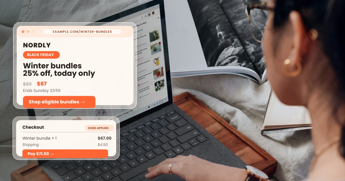
Your Black Friday email says a winter bundle is 25% off until Sunday. A reader clicks, lands on your ordinary homepage, searches for the bundle, finds a different price and abandons the visit. The email may have done its job perfectly. The path after the click broke the promise.
A useful Black Friday landing page is the bridge between a specific message and a confident purchase. It tells a visitor what is included, what the price really is, when the offer ends and what happens next. This guide focuses on that bridge: how to plan the page, connect it to email, test the checkout and learn from the result. The examples are illustrative, so replace every product, price and deadline with your actual terms.
What is a Black Friday landing page supposed to do?
A Black Friday landing page is a focused destination for a seasonal offer. It helps a visitor understand the offer and take the next appropriate action: shop a collection, choose a product, buy a bundle or join a clearly described early-access list. It is not necessarily a separate website or a page builder feature. A well-prepared collection or product page can do the job if it carries the same information and action.
Start with the intent of the click. Someone who clicked “See the winter bundle” expects the bundle, not a list of every promotion. Someone who clicked “Get early access” expects the signup terms, not a checkout that is still closed. Match one promise to one destination. If you have several offers, use separate destinations or make the first choice exceptionally clear.
| Promise in the email | Best destination | Primary action |
|---|---|---|
| “Explore the winter bundles” | A filtered collection with eligible bundles | Choose a bundle |
| “Save on the starter kit” | The starter kit offer or product page | Add the kit to cart |
| “Join early access” | A signup page stating what follows | Subscribe with consent |
| “Finish your order” | The existing cart when available | Review and complete checkout |
This decision also makes measurement cleaner. If every email points to one generic sale hub, you may see visits but struggle to tell which offer brought someone there. A direct, descriptive destination gives the customer less work and the team a clearer path to inspect.
Write the offer contract before designing the page
Write one internal sentence that customer support, the email writer and the person editing prices can all understand. Include the eligible products, price or discount, audience restrictions, start and end times with time zone, code requirement, shipping conditions and any meaningful exclusions. This is the offer contract. The page can present it attractively, but every visible claim must agree with that source.
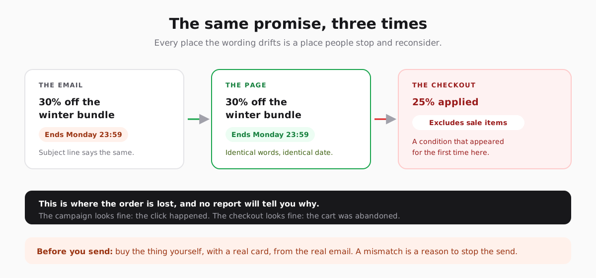
The contract prevents a common launch-day split: the email says “everything,” the page says “selected items,” and checkout excludes one of the items shown. Do not rely on small print to repair a misleading headline. If the discount applies to a subset, say “selected winter bundles” in the subject line, page heading and product labels. If a code is required, show it beside the main action and test it with an eligible cart.
Use a real deadline. A countdown that restarts when a visitor returns weakens trust and can create support problems. If stock is limited, describe the actual inventory condition instead of adding a fake scarcity message. Confirm whether the sale ends at midnight in the store’s time zone or the customer’s; display one unambiguous time on both the page and emails.
Build the page in the order a buyer makes decisions
The first screen should answer four questions without scrolling: What is the offer? Who or what is eligible? When does it end? Where do I go next? A product image helps when it shows the actual item or bundle; a decorative Black Friday pattern cannot replace it. Place the main button near those answers, and make the button label describe the destination, such as “Shop eligible bundles.”
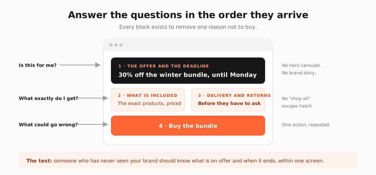
After the first screen, show the eligible products or one specific offer in enough detail to decide. Include the regular and sale price when both are accurate, variant choices, stock status and what the bundle contains. Then answer practical objections: delivery window, shipping cost, returns, sizing, setup or support. Put trust signals where they help, using real reviews or policies you can substantiate. Invented customer counts and generic badges add noise.
Keep the page readable when images do not load. The offer, price, conditions and button label should be text, not baked into a graphic. On a phone, avoid a hero that pushes the product and action several screens down. Check line wraps, tap targets, contrast and whether a sticky button obscures terms or the checkout control.
A small page can be complete
For one bundle, a concise page may need only a clear heading, product image, price, included items, delivery and returns summary, conditions and one action. A complex catalog needs filtering or a collection view. Do not add sections merely to make a landing page look substantial; add them when they resolve a specific buying question. A separate FAQ is useful only if those questions are real and the answers are current.
Make the email and page sound like one conversation
The subject line, preview text, email body, button and destination should preserve the same offer. A visitor should recognize the page before reading its details. Repeat the key product name and value in the page heading; use the same deadline and conditions. If the email promises a curated guide to choosing a product, the page should provide that guide before asking for a purchase.
Different audiences can enter the same sale through different messages. A returning customer may receive a direct link to a familiar product; a new subscriber may need a short explanation of how it works. You do not always need separate page builds. Use the same accurate offer page when it answers both groups’ questions, and create a separate destination only when their decision is genuinely different. The Black Friday email campaign plan covers audience and sending cadence in more detail.
Do not treat a tracking parameter as an offer rule. If early access or a private price is restricted, enforce eligibility in the store or checkout, not only in the link. A forwarded email, copied URL or browser refresh should not reveal a price the visitor is not entitled to use. Keep marketing consent separate from a purchase: a checkout email address is not automatically a newsletter subscription.
Test the complete path before the first send
A preview of the page is not enough. Open a delivered test email on a real phone, follow the button, choose an eligible product and continue through checkout as far as your test setup permits. Repeat with an excluded product and an expired or invalid code. Have someone unfamiliar with the project do the same; they will notice terms the team has learned to overlook.
- Email to page: every subject, link and button lands on the intended live URL; preview text and heading describe the same offer.
- Offer to cart: product variants, availability and shipping information survive the transition without surprising changes.
- Cart to checkout: the discount appears on the right items; totals, taxes and delivery charges are understandable before payment.
- Mobile experience: the page loads over a normal mobile connection; the primary action remains visible and usable without layout jumps.
- Accessibility: offer terms remain readable as text; images have useful descriptions and keyboard focus reaches the main action.
- Failure paths: an out-of-stock item, broken code or ended sale shows a helpful next step rather than a dead page.
Assign one owner for the page and one for the campaign. If someone changes prices, eligibility or product availability after the test, the owner checks the email and checkout again. Keep a short copy of the approved offer contract and test results so a last-minute correction can be compared with the version everyone signed off.
Measure where interest turns into uncertainty
Start with counts, not a single “conversion rate.” For the same reporting window, record delivered emails, unique clickers, landing page sessions, product views, add-to-carts, checkout starts and completed orders. These numbers come from different systems and may use different definitions, so do not force them into a perfectly balanced funnel. A visitor can return directly, switch devices or buy after a different message.
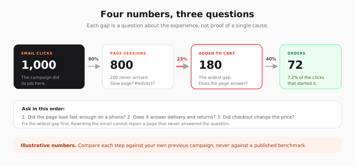
If clicks are healthy but few sessions load, inspect the destination, redirects and page speed. If visitors arrive but do not add anything to cart, examine offer clarity, product availability and mobile layout. If carts start but orders do not finish, test the discount, shipping cost and payment flow. These are hypotheses to investigate; the report alone does not tell you why people left.
Review the commercial result after discounts, fulfillment costs, returns and support load, where your data allows it. Report unsubscribes and complaints alongside orders. Attributed revenue is a useful model, but it does not prove that an email caused every purchase. A small audience can produce large percentage swings from only a few orders. The email marketing metrics guide explains how to read those signals together.
Plan what happens when the sale ends
Write the post-sale state before launch. When the deadline passes, remove the old discount claim and show current prices. If the page has earned search links or social shares, keep a useful destination: a current collection, a waitlist with clear expectations or a guide to choosing the product. Do not leave an expired countdown and an invalid checkout button live for weeks.
Customers also need a follow-up that matches what they bought. Send setup, care or delivery information through the right channel, and stop promotional reminders for the same purchase when the store data is available. The goal is a clean handoff from a seasonal offer to a lasting relationship. Our post-purchase email guide covers that next stage.
Where Send Tim fits in the journey
Build the offer page and checkout in your store or website. Use Send Tim to organize the subscribed audience, create the Black Friday email, test the message and send it to the destination you verified. If you collect early-access signups, make the subscription promise and consent clear, then follow up only with the people who joined. Send Tim’s forms, segments and automations can support that email side of the journey.
Keep the offer contract beside the campaign draft. Before scheduling, compare the email with the live page and test the delivered message. Afterward, combine email clicks with store results to see where the experience needs work. The strongest improvement may be on the page or checkout rather than in the subject line.
Frequently asked questions
What should a Black Friday landing page include?
Show the exact offer, eligible products, price or discount, real deadline, relevant product details and one clear action. Answer practical questions such as shipping, returns and exclusions near the decision. Test the final amount at checkout.
Should Black Friday emails link to a homepage or a landing page?
Link to the destination that fulfills the email promise most directly. A specific product, eligible collection or early-access signup is usually more useful than a generic homepage. A normal product page can serve as the landing page if it carries the offer and terms clearly.
Do I need a separate landing page for every audience?
No. Use one page when it answers the same buying questions for each audience and enforces the same offer. Create separate destinations when the product, eligibility, explanation or next action genuinely differs.
How do I know whether a Black Friday landing page worked?
Track the path from email clicks to page sessions, product views, carts, checkout starts and orders over a consistent period. Review where people leave, test possible causes, and judge the result after discounts and fulfillment costs when that data is available.
What should happen to the page after Black Friday?
Remove expired claims and invalid discounts. Keep a useful current destination, such as a regular product page, relevant collection or clearly described waitlist, so old links do not lead to a dead end.